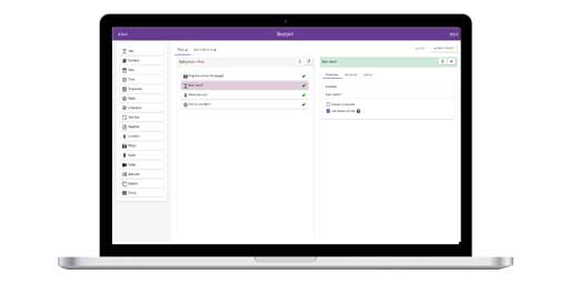
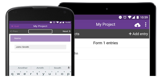
Free and easy-to-use mobile data-gathering platform.
Have a look at our featured projects below or find a project


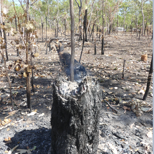


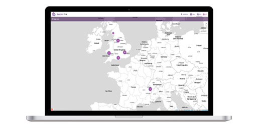
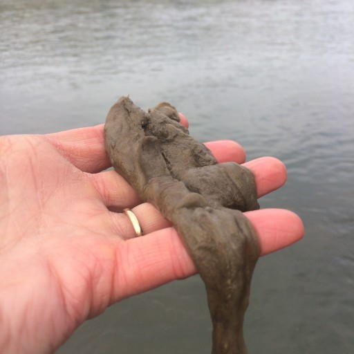 Discovering Didymo Distribution
A citizen science project leading to increased awareness on the distribution of this diatom.
Thousand of people use Epicollect5 every day to collect data all over the world.
people
Users
314K
list_alt
Projects
125K
cloud_upload
Entries
47M